
Pantone’s 2026 Color of the Year: Why it Has Homeowners Talking
When Pantone revealed its 2026 Color of the Year, the design world paused and collectively thought: “They chose… white?”
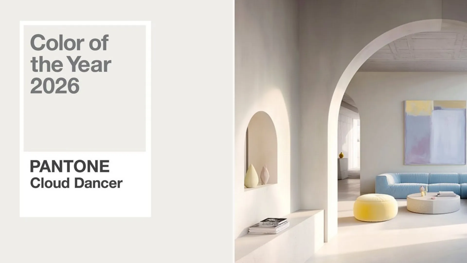
Cloud Dancer (PANTONE 11-4201) is a soft, airy and serene neutral that Pantone describes as a “whisper of calm and peace in a noisy world.” It’s meant to symbolize quiet reflection and the mental space that creativity needs to breathe.
And somehow? This gentle white has sparked one of the loudest debates we’ve seen around a Color of the Year in a long time.
Pantone paints Cloud Dancer as a sort of living calm, a shade that drifts effortlessly between light and ethereal, offering a moment of visual stillness in a world that feels overstimulated. The controversy comes from everything around it.
For some designers, choosing a pure white feels refreshing, even bold in its restraint. For others, the pick feels anticlimactic, like a “non-color” at a time when people were expecting something expressive or energizing. And in a year marked by cultural nuance, geopolitical tension, and conversations about identity, some critics say the symbolism of a stark white shade lands awkwardly. It’s rare for a Color of the Year to launch think pieces, but Cloud Dancer managed exactly that.
Still, the debate doesn’t change the fact that Cloud Dancer is going to influence 2026 design in a major way. Paint collections, textiles, furniture lines, décor, remodel palettes - all of it will echo this soft, misty white.
And for Northern California homeowners, this is actually a good thing.
Our region is uniquely suited for a color like this. Cloud Dancer thrives in natural light and for most of the year, NorCal has no shortage of it. East Bay sunshine, coastal fog filtered brightness, airy Marin mid-century homes… this is the type of light that makes Cloud Dancer read as soft and elevated rather than stark.
It also pairs effortlessly with the materials that define Northern California design. Whether it’s warm woods, natural stone, matte black hardware or greenery, Cloud Dancer doesn’t fight these elements. It frames them. It’s like giving your favorite décor a quiet little spotlight.
But let’s be honest: white is tricky. If you use it flatly (one tone, no texture) your home can start feeling sterile pretty quickly. Cloud Dancer needs depth. Soft linens, boucle, rattan, pottery, layered neutrals, mixed woods, soft metal finishes…these are what turn the shade from “blank wall” into “peaceful, intentional design moment.”
Lighting matters just as much as texture. Cloud Dancer looks best in spaces where light stays somewhat consistent, so it isn’t swinging between too warm and too cool. Think open living rooms, bright kitchens, bedrooms with natural light, hallways, and modern powder rooms. If you’re unsure about fully committing, try using it on trim, interior doors, a vanity, or even just a single accent wall - enough to feel the effect without repainting the whole house.
And whether or not you personally love the pick, Cloud Dancer is absolutely going to shape how 2026 looks. Retailers will follow it. Designers will echo it. Home décor brands will reinterpret it. A soft white might not feel as exciting as a jewel tone or a moody color, but it sets a fresh, calm foundation for the textures and accents that will define the year ahead.
If you’re thinking about refreshing your home, whether with Cloud Dancer or a completely different palette, TheHomeMag’s pros can help you bring the right vision to life. Explore painters, remodelers, designers, and more through our digital magazine and connect with trusted local experts who know how to make your home shine.
Thinking About Your Next Home Improvement Project?
Enter our current Northern California homeowner giveaways for a chance to win kitchen remodels, bathroom upgrades, windows, doors, and other home improvement projects from trusted local contractors.
Current giveaways valued up to $20,000.